Benzinga is a leading media and data technology company covering stocks, investments, business, and personal finance for “investors of all stripes and styles.” In addition to its robust online content ecosystem, the company produces online, live, and hybrid events and conferences focused on various high-profile industries.

Challenge
The Benzinga Events team set a goal to host 22 live or virtual/live hybrid events in the third and fourth quarters of 2021, including many that needed original branding and a fresh look and approach. The first hybrid event would be the Benzinga Electric Vehicles Conference, and the company wanted to make a strong statement from the starting line.
But the Benzinga team has lacked an in-house designer since early 2020. Many of the virtual events slated on the calendar did not need a comprehensive branding strategy or visual design, but the team decided the shift to live and hybrid conferences required “extra muscle.”
Most importantly, Benzinga wanted to set itself apart from competitors in a crowded space, portraying EV CON, Powered by Benzinga, as a premium and exclusive event designed to connect investors with companies in the EV space and offer knowledge and education to investors about this fast-growing industry.
Approach
Benzinga had worked with Hawke Media on thought leadership projects in the past, so the marketing consultancy was the clear choice to manage the branding not just for EV CON.
With a Logo & Style Guide package, Benzinga received design services and additional assets, all created through careful collaboration and consultation. The Hawke Media team entered the project with multiple objectives:
- Create a brand that is futuristic and modern, as well as a clean, minimalistic design
- Convey the brand’s four pillars: Electric, futuristic, premium, and exclusive
- Develop a “TRON-like” logo that relays the electric nature of the conference while reflecting Benzinga’s existing branding
- Design a style guide with clear directions on how to use each element
A LOGO WITH ELECTRIFYING APPEAL
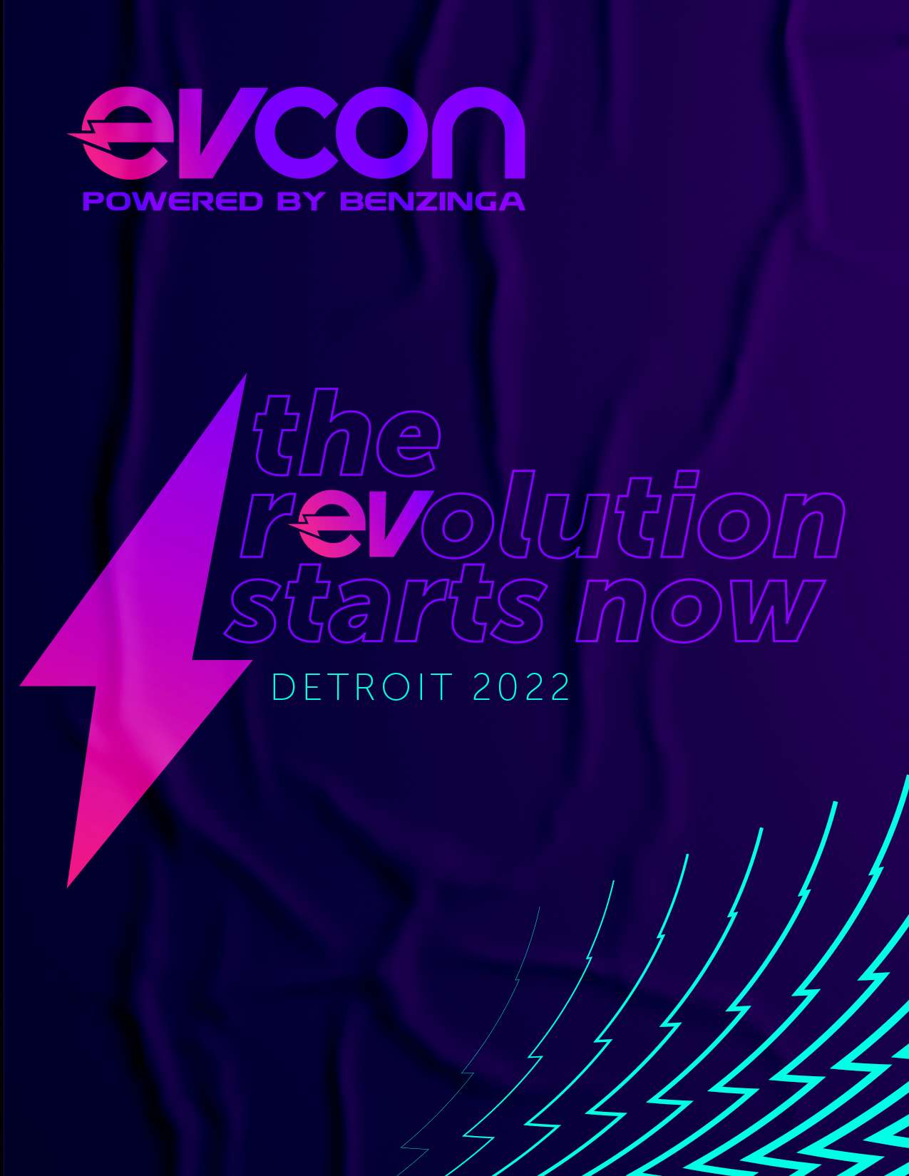
Based on Benzinga’s creative direction and feedback, we developed a logo that merged well with the existing Benzinga logo while conveying the electrifying energy of EV CON. The “e” was designed with a bolt of electrically passing through it, giving a literal yet subtle nod to the EV industry. The slanted “V” conveys a sense of forward motion and intense acceleration delivered by electric vehicles. That motion also alludes to EV CON’s mission of ushering the electric vehicle vertical into the future. Clean and compelling, the logo is distinctive and recognizable.
PLUG & PLAY BRANDING ASSETS
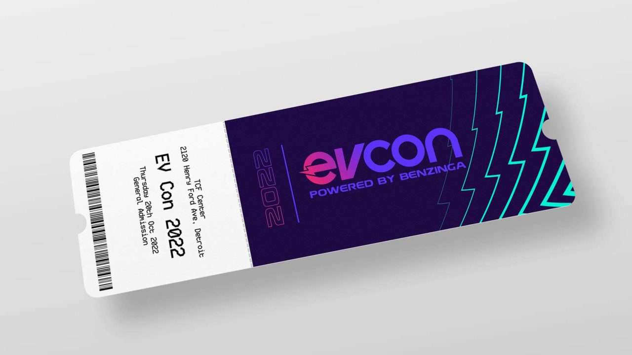
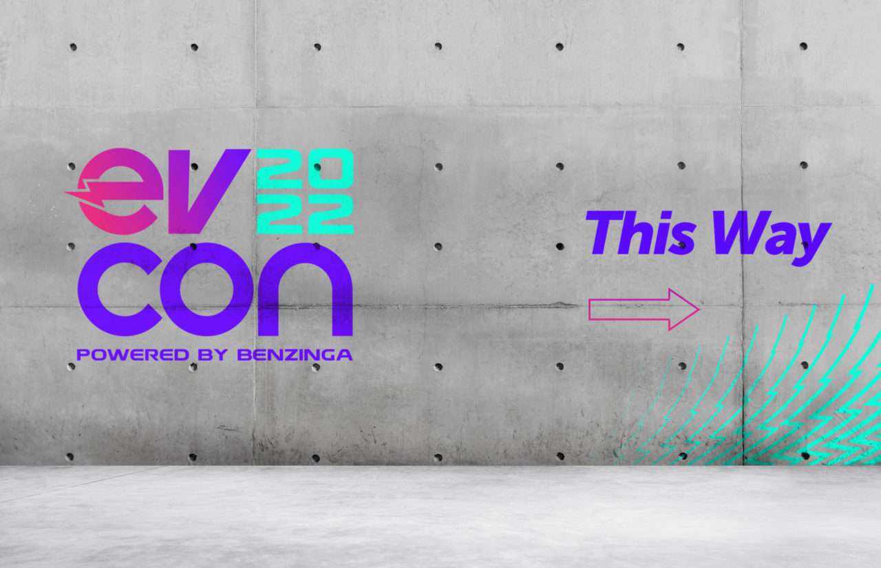
The style guide delivered fluid, plug-and-play assets that provided the client with flexibility to deploy various components as different challenges arise. The font styles chosen had multiple options in weights and varieties, further adding to the flexibility and versatility of the marketing package across print and the Web.

DESIGN THAT BLENDS RETRO AND FUTURE ELEMENTS
Key to the success of the project was our ability to blend retro and future elements to execute the client’s vision for branding. In early brainstorming conversations with the client, Benzinga mentioned properties such as the original Tron movie from the 1980s, classic Atari games, and other aspects of GenX nostalgia.
They also wanted the logo to remind people of the first frontier of electric vehicles in the late ‘70s and early ‘80s, capturing that retro energy as a driving force behind the Benzinga EV Con brand, but with a modern spin. The various elements work together to show an industry – and brand – moving forward into the future with lightning speed.
