Greenbox is an interactive, touch-screen-operated kiosk for use in dispensaries, designed to make the purchase of medical marijuana both easy and efficient.

Challenge
Greenbox came to us ready to launch headfirst into the “green rush” with their innovative product, but needed to make sure their brand was sleek and modern, elevating the product’s tech-focused nature, without diluting the fun of a cannabis purchase.
Approach
- Developed logo that balanced tech and cannabis elements of the brand
- Selected typefaces that would harmonize with brand aesthetic
- Created 3D product rendering with Lead Engineer
- Developed conversion-optimized website that balanced creative assets and informative content
- Designed branded Marketing Collateral
- Designed UX/UI optimized for commerce
VISUAL IDENTITY
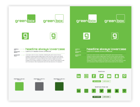
In order to create a strong, recognizable brand, we shifted the focus away from the industry-standard cannabis leaf, instead opting for a minimal and recognizable logomark with a green color balance to draw reference back to the cannabis space. For typography, we settled on Orbitron for the headline font – this bold, sans-serif typeface is consistent with Greenbox’s tech-forward visuals. To complement Orbitron, we selected Quicksand for body copy because its geometric letter anatomy is clean, soft on the eye, and easy to read.
PRODUCT DESIGN
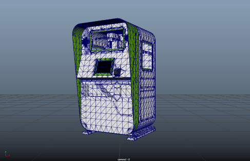
With the branding set, we partnered with Fastcorp LLC, a robotic kiosk manufacturer, whose engineers sketched out an innovative kiosk that combined functionality with an engaging visual experience. After iterating through many vector concepts, we moved our final version into collaborative 3D software that allowed the the engineers to build the machine while we added branding elements and color.
UX/UI
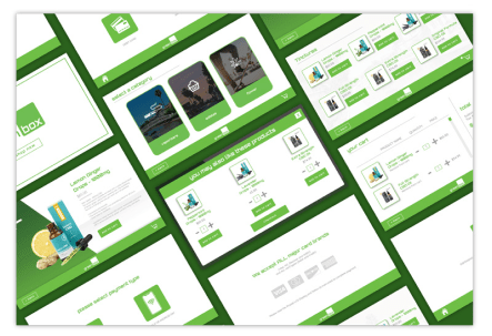
With the hardware completed we started to focus on the software. In tandem with AAEON Electronics, the software programmers, we designed a commerce focused user interface. we took into account many variables concerning user experience and tested how consumers reacted to the different flows we had created in order to optimize each screen. These flows included an add to cart system, product up-sell, checkout, payment paths for card and smart pay, vend fails, and age verification.
WEB
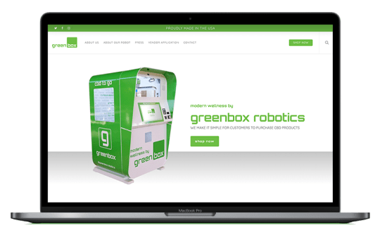
Leveraging the beautiful branding elements we developed as well as informative content, we created an engaging web experience that demonstrates the benefits of Greenbox to dispensary owners, showing them why they need one in their store.
MARKETING COLLATERAL
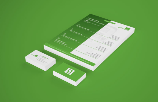
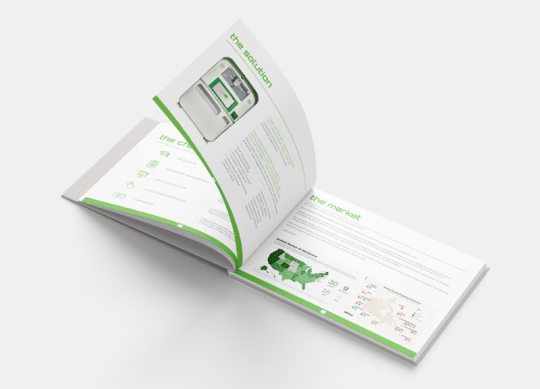
We developed an investor pitch deck to help secure funding to further optimize success and development of the physical machine. Having secured early funding and the pitch deck ready to bring in future investors we designed informative one-sheets, letterheads, business cards and other pieces of marketing collateral to start reaching out to dispensary owners all of which helped bring in early sales.
SOCIAL MEDIA
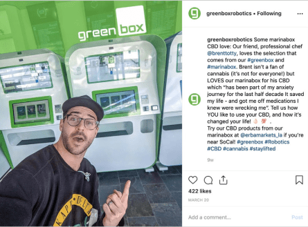
We created and implemented a social strategy to increase overall brand awareness and improve their social presence. Our strategy included posting a mix of lifestyle and product shots in cadence with industry-related articles each week. Over time, we established greenbox as an authority source for Facebook and Twitter growth by interacting with brands and publishing those third-party articles. We also boosted their following to over 10k on Instagram by posting hi-res imagery within their niche industry and sharing their overall brand story.
STRATEGY
Our Strategists assisted in the creation of the greenbox pitch deck. They outlined what pieces of content would be of interest to potential investors in the cannabis industry and handed it off to one of our designers. While the designer wireframed the deck our strategists did deep research into the challenges consumers face when purchasing from dispensaries, created value proposition that explained how greenbox addresses these issues, and looked into the current market to determine the potential traction greenbox could receive.
Results
-
Grew IG Followers
0k