Designing Data-Driven Infographics That Tell Stories
Infographics have become a cornerstone of content marketing and data communication. At their best, they distill complex data into a visual narrative that resonates with the audience. Whether you’re presenting industry trends, campaign results, or consumer insights, designing a data-driven infographic is as much about storytelling as it is about aesthetics. Here’s a deep dive into creating infographics that don’t just inform but engage and inspire.
1. Start with a Narrative Framework
An infographic without a narrative is just a collection of numbers. To captivate your audience:
- Define Your Core Message: What is the one takeaway you want your audience to leave with? For example, “Our campaign doubled engagement rates in Q3” or “Remote work is reshaping productivity trends.”
- Structure the Story: Break your data into three segments:
- Introduction: Contextualize the problem or question.
- Body: Present the key data points and insights.
- Conclusion: Offer actionable takeaways or predictions.
Example: Imagine presenting the rise of electric vehicles. Start with the problem (climate change and reliance on fossil fuels), move into the data (growth in EV adoption, reduced carbon emissions), and end with a call-to-action (support policies for EV infrastructure).
2. Choose the Right Data
Not all data is infographic-worthy. Select data that is:
- Relevant: Ensure it aligns with your narrative and audience interests.
- Digestible: Use clear, concise metrics rather than overwhelming details.
- Reliable: Always source from credible databases or research, and include citations.
Tip: Pair quantitative data (numbers, percentages) with qualitative insights (quotes, testimonials) to add depth.
3. Use Visual Hierarchies
The brain processes visuals 60,000 times faster than text, but that doesn’t mean every visual is effective. Organize your infographic with a clear hierarchy:
- Start Big: Use a bold headline or stat to grab attention.
- Cluster Information: Group related data together using color blocks, shapes, or white space.
- Highlight Key Metrics: Use larger fonts or contrasting colors to emphasize the most important numbers.
Example: In an infographic on global internet usage, you could emphasize “5.18 billion internet users in 2023” in bold at the top, then break down usage by regions or devices in smaller sections.
4. Simplify the Design
Design simplicity is crucial for retaining viewer attention. Here’s how:
- Limit Colors: Stick to a palette of 2-4 colors that align with your brand or theme.
- Avoid Clutter: Use icons, charts, or illustrations sparingly to avoid overwhelming the viewer.
- Readable Fonts: Choose sans-serif fonts for clarity, and avoid overly decorative typefaces.
Pro Tip: Negative space is your friend. A clean, spacious layout ensures the audience focuses on the data, not the design noise.
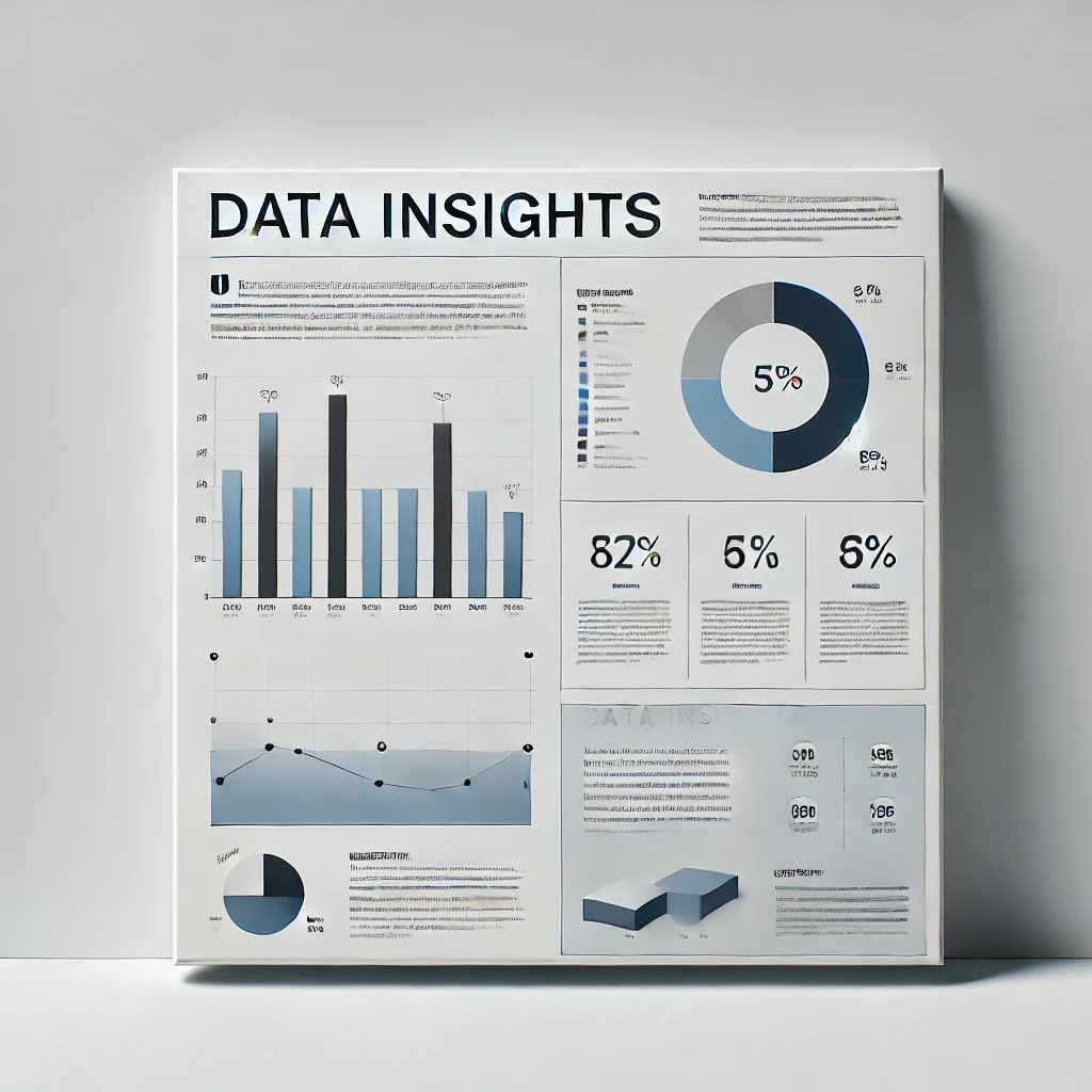
5. Pick the Right Visualizations for the Data
Each type of data requires a specific type of chart or graphic:
- Comparisons: Bar or column charts work best.
- Trends Over Time: Use line charts to show progression.
- Proportions: Pie charts or donut charts visualize percentages effectively.
- Relationships: Scatter plots or bubble charts illustrate correlations.
- Geographic Data: Maps are ideal for location-based insights.
Tool Highlight: Platforms like Tableau, Canva, and Infogram offer templates and tools to simplify this process.
6. Incorporate Engaging Elements
Infographics that tell stories often use additional elements to enhance engagement:
- Icons: Represent abstract concepts visually.
- Annotations: Add brief explanatory notes for complex data points.
- Interactive Features: For digital formats, enable hover-over effects, clickable sections, or animations.
Example: An interactive infographic on consumer spending could allow users to click different age groups to see tailored spending habits.
7. Optimize for Distribution Channels
Where you share your infographic influences its design:
- Social Media: Create condensed, shareable versions with bold text and bite-sized insights.
- Websites: Design long-scroll infographics that work well on desktop and mobile.
- Presentations: Include segmented slides or export graphics for PowerPoint or Google Slides.
Best Practice: Always test your infographic on the intended platform to ensure legibility and visual impact.
8. Validate Your Work
Before publishing, check:
- Accuracy: Double-check all data points and citations.
- Clarity: Share with a colleague for feedback on whether the story is clear.
- Accessibility: Ensure your infographic is readable for all audiences, including those with visual impairments (e.g., high contrast, alt text).
9. Promote and Measure Impact
Once your infographic is ready:
- Promote Across Channels: Share it via email campaigns, embed it in blogs, or pitch it to industry publications.
- Repurpose Content: Break it into smaller graphics for Instagram posts, LinkedIn carousels, or Twitter threads.
- Track Performance: Use metrics like shares, likes, and time spent on page to measure effectiveness.
Closing Thoughts
Infographics are more than just pretty pictures—they’re a way to distill complexity into digestible, memorable stories. By following these principles, you’ll create designs that not only inform but also drive engagement and action. Remember, the ultimate goal of any infographic is to connect your audience to the insights that matter most. Whether you’re presenting quarterly performance data or highlighting industry trends, the power of visual storytelling is unmatched in its ability to educate and inspire.